How do I check responsive layouts with a coding agent?
Use Ascended Browser 0.1.5 to inspect a page at phone, tablet and desktop widths, then capture the states that explain a layout problem. These checks exercise desktop Firefox layout, not a real mobile device.
Connect the client and choose a page state
Use the QA quickstart for Codex CLI or Claude Code setup. Start your app and choose a reproducible state: for example an open navigation menu, a form with validation errors or a populated results list.
Linux is the documented platform for native window resizing. Xvfb can supply a virtual display; other platforms remain untested in the project documentation. Over SSH, the app must be reachable from the client's dev box.
Copy this responsive QA prompt
Use Ascended Browser to check http://127.0.0.1:3000.
Do not edit source code. Use disposable local data only.
Open the page, observe controls and identify the state being tested.
Check phone, tablet and desktop presets sequentially on the same tab.
At each size record the returned actual dimensions and use fresh refs.
Check navigation, clipping, horizontal overflow, overlapping controls,
readable text and whether the primary action is reachable.
Interact with local menus/forms where needed to expose those states.
Capture a viewport screenshot for each relevant visual defect.
Then check dark mode and reduced motion separately, if supported by the app.
Distinguish observed problems from suspected causes and untested behavior.
Restore the viewport and clear emulation at the end.
Stop before purchases, external messages or destructive actions.
Resize, read back and use fresh refs
These JSON objects are MCP arguments. Replace TAB_ID with the tab returned by browser_open.
Set phone size, browser_viewport:
{"tab_id":"TAB_ID","action":"set","preset":"phone"}
Presets request phone 390×844, tablet 768×1024 and desktop 1365×768 CSS pixels. You can instead pass width and height without a preset to check a specific breakpoint.
A successful resize includes a fresh page observation; use its refs rather than pre-resize positions. Record returned dimensions and any clamping. Resizing targets the shared native window, so run size checks sequentially rather than assuming independent tab viewports.
Read current dimensions, browser_viewport:
{"tab_id":"TAB_ID","action":"get"}
Capture the visible state, browser_screenshot:
{"tab_id":"TAB_ID","scope":"viewport","label":"Phone navigation open"}
The screenshot reports capture dimensions. Use them over an earlier size request if the window changed. A full-page screenshot is available but is cut at 8000 pixels; it is not proof that every scroll position was checked.
Check media preferences separately from size
For browser_viewport, {"tab_id":"TAB_ID","action":"emulate","color_scheme":"dark"} requests dark preference. reduced_motion:"reduce" and forced_colors:"active" are separate preference checks, not proof of accessibility compliance.
Use browser_extract with read:"inspect" and a current target_ref to investigate a clipped or covered control; read:"design" reads CSS layout/style facts. read:"audit",checks:["accessibility"] can supplement manual inspection, not replace it.
For a before/after screenshot comparison, keep the same viewport, scroll position, scope and UI state; compare_with:"previous" compares with the tab's previous capture. Intentional reflow between phone and desktop is not itself a regression.
Finish with browser_viewport arguments {"tab_id":"TAB_ID","action":"restore"} to return to launch sizing and clear emulation. If an interaction loses its result, observe before retrying.
Report defects with the exact state tested
Name the page, actual dimensions, UI state, expected requirement, observed defect and screenshot. Don't call a page “mobile compatible” from three screenshots; touch behavior, mobile browser identity and device-specific behavior remain outside this check.
Evidence from the local fixture
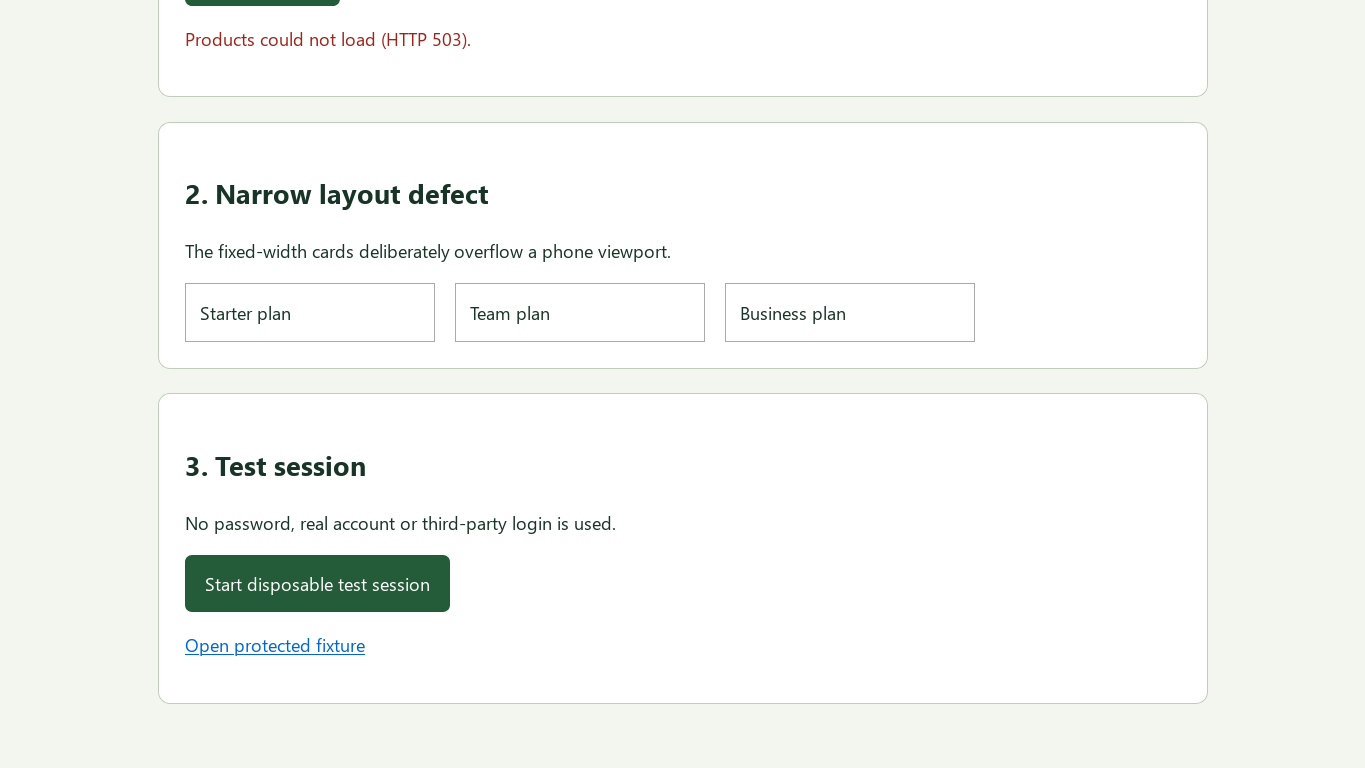
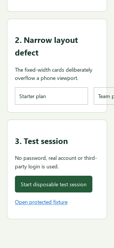
The 0.1.5 package was driven by a real MCP client on Linux on October 6, 2026. The fixture deliberately puts three plan cards inside a fixed-width 700px row. The requested desktop and phone sizes were returned as 1365 × 768 and 390 × 844, without clamping.
The captures below show the same layout section at different scroll positions chosen to expose it. At phone width, the row extends past the right edge rather than wrapping. This is an intentionally introduced defect, not a regression discovered in a user's app. Tablet, dark mode and touch behavior were not tested by this harness.
Reproduce the captures
From the repository root, after the quickstart's virtual-environment setup:
.venv-qa/bin/python tests/qa_guides_demo.py
The fixture captures these two sizes and restores the viewport. The visible defect is evaluated from the screenshots, not an automated visual-regression assertion. Read the fixture source.